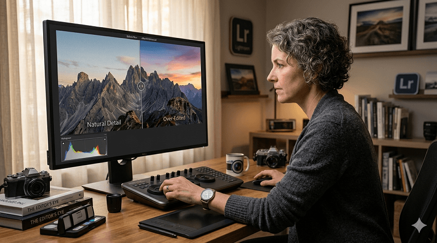
In an era where a single click can replace a sky or smooth every pore on a face, the line between an "enhanced" photograph and a digital "uncanny valley" has never been thinner. We live in a golden age of post-processing; software is more powerful than it has ever been, offering us the ability to recover lost shadows or upscale low-res files into gallery-standard prints.
However, with great power comes the very human temptation to use all of it. We often fall into the "More is Better" fallacy. We start with a little bit of contrast, then a touch of vibrance, and before we know it, the soul of the original moment is buried under layers of artificial pixels. The photo no longer looks like a window into a memory; it looks like a demonstration of a software's capabilities.
The goal of a professional edit isn't to show off the tools we used—it's to emphasize the story, the light, and the emotion of the original capture. In this post, we're going to explore how to master the "invisible hand" of editing, ensuring your final output looks intentional, polished, and, above all, real.
Part 1. Signs You've Gone Too Far - How to Know if a Photo is Over Edited
It happens to the best of us: you spend an hour staring at a screen, and your eyes begin to "normalize" the extreme adjustments you're making. Suddenly, a radioactive sunset looks perfectly natural—until you look at it again the next morning.
To maintain a professional standard, you need to recognize the technical red flags that scream "over-edited." Here are the most common signs that it's time to dial it back:
1. The Loss of Natural Texture
One of the most obvious giveaways is the "plastic" look. This usually happens when noise reduction is applied too aggressively, or when AI-driven smoothing tools scrub away the organic details. Whether it's the fine pores in a portrait or the rugged surface of a stone in a landscape, losing that texture makes the image feel flat and artificial.
2. Halos and Edge Artifacts
If you see a faint, glowing outline around a mountain peak or a person's silhouette against a sky, you've likely pushed the Clarity, Dehaze, or Sharpening sliders into the danger zone. These "halos" are a byproduct of the software trying to create local contrast, and they are an immediate signal of heavy-handed processing.
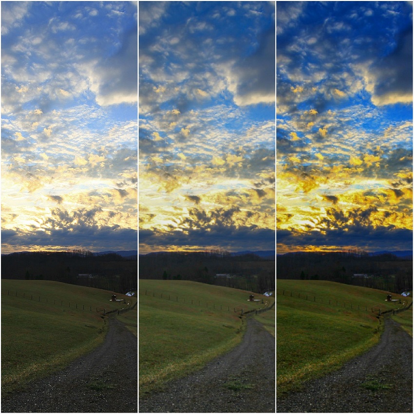
3. Fluorescent Color Shifts
There is a difference between "vibrant" and "neon." When the greens in a forest start to look like highlighter ink, or the blues in water lose their depth and become a solid cyan block, you've exceeded the natural gamut of the scene. Over-saturating specific channels often leads to a loss of tonal nuance within that color.
4. "Crunchy" Pixels and Digital Noise
While we often edit to remove noise, over-sharpening can actually create a different kind of digital "grit." If the fine details of your image look jagged, brittle, or "crunchy" when viewed at 100%, the software is inventing edges that weren't there, leading to a harsh, unappealing aesthetic.
5. Clipping the Histogram
A quick glance at your histogram will tell the objective truth. If the graph is "piling up" against the far left (shadows) or the far right (highlights), you are losing data. "Crushing" the shadows to create mood or "blowing out" the highlights for a high-key look can work, but doing it accidentally results in large blocks of solid black or white that lack any printable detail.
Part 2. How to Avoid Over Editing Photos
Method 1. The Strategic Workflow: Technical Foundations
The best way to avoid over-editing is to stop treating the process like a rescue mission and start treating it like a construction project. A chaotic workflow leads to "piling on" adjustments to fix mistakes made in previous steps. By following a structured sequence, you ensure that every slider move is purposeful.
1. Start with the "Boring" Stuff (Global Adjustments)
Before you touch the "creative" sliders like Clarity or Texture, you must establish a neutral baseline.
- White Balance: If your temperature is off, your colors will never look right, no matter how much you adjust the saturation. Fix the "lean" (too blue or too orange) first.
- Exposure & Contrast: Set your brightness levels and establish your black and white points. This builds the "bones" of the image.
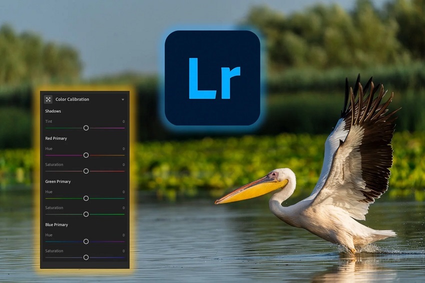
2. The Power of Camera Calibration
A professional secret for natural color is using the Calibration panel (often found at the bottom of the develop module in Lightroom) rather than the basic Vibrance slider. Adjusting the "Red, Green, and Blue Primaries" changes how the camera interprets the RAW data itself. This results in much deeper, more sophisticated color shifts that feel like they belong to the photo, rather than sitting like a film on top of it.
3. Preserving the RAW Data
Always keep an eye on your dynamic range. Modern sensors capture an incredible amount of information, but it is fragile.
- Avoid "crushing" your shadows too early in the process.
- If you find yourself moving a slider to +100 or -100, stop. That is usually a sign that you are fighting the file rather than working with it. Instead, try a combination of smaller moves across different panels (e.g., a little bit of Highlight reduction combined with a slight adjustment to the Tone Curve).
4. The "Middle-Out" Approach
Instead of applying a heavy "Look" or Preset at 100% opacity, try the "Middle-Out" method: apply your baseline corrections, add your creative look at 50% intensity, and then use local adjustments (Masking) to finish the job. This prevents the "global" edit from overwhelming the natural nuances of the shot.
Method 2. Smart Use of Modern Enhancement Tools
We are currently living through a revolution in photo editing. AI-driven tools have made it possible to "fix" photos that were previously destined for the trash bin. However, these tools are also the fastest way to make a photo look artificial if not managed with a careful hand.
1. AI Denoising: Clean vs. Clinical
Modern AI noise reduction has become incredibly adept at removing grain, but the trap is removing all of it. When you remove 100% of the digital noise, you often remove the micro-textures that tell our brains an image is real.
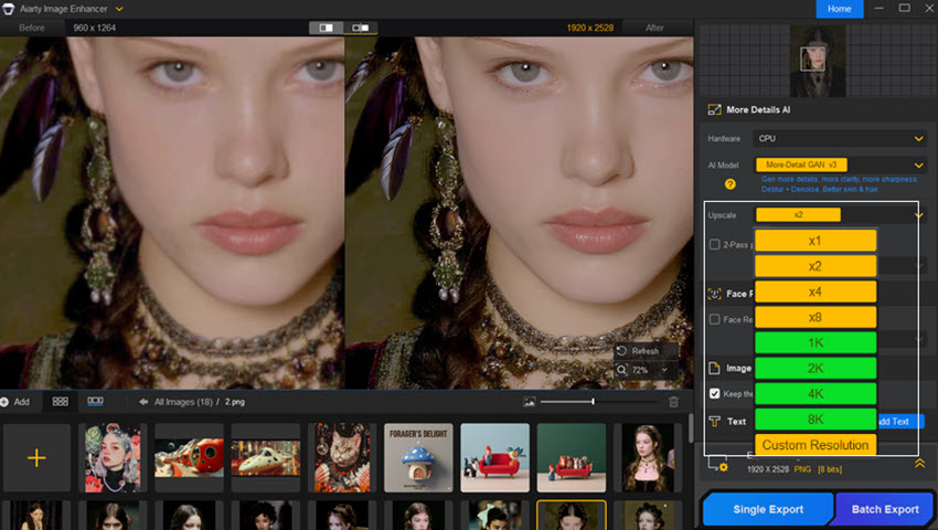
To combat this, professional tools like Aiarty Image Enhancer are designed with a focus on "intelligent" reconstruction. Rather than just blurring out noise, it works to restore or generate realistic details that may have been lost in low light. This allows you to clean up a high-ISO shot while maintaining the integrity of skin pores or fabric textures—avoiding that dreaded "plastic" look.
2. The Upscaling Paradox
AI upscaling is a miracle for printing small crops, but it works by "guessing" what pixels should be there.
- Watch for "Hallucinations": Some upscalers can create weird patterns in grass or give eyes a slightly "robotic" look.
- The "Detail-First" Approach: When using a tool like Aiarty, the goal is to upscale while retaining a "photographic" feel. It's particularly effective because it's trained on high-quality RAW imagery, meaning it understands the difference between a sharp edge and a natural texture. This is vital when you want to prep a photo for a large gallery-standard print without it looking like a digital painting.
3. Masking: The Secret to Subtlety
The most dangerous sliders in any program are the ones applied to the whole image.
- Selective Editing: Instead of raising the "Exposure" of the entire photo to fix a dark subject (which washes out the sky), use Subject Masking.
- Feathering is Key: When using masks to select a person or a sky, always check the "Feathering." A hard line between an edited subject and an unedited background is a dead giveaway of poor processing.
4. Generative Fill and AI Erasers
It's tempting to remove every "distraction" in a frame—the trash can in the park, the power lines, the stray hair.
- The "Lived-In" Look: Too much "cleaning" can make a scene feel like a 3D render rather than a captured moment.
- The Rule of Three: If a distraction isn't actively pulling the eye away from the subject, consider leaving it. A few imperfections give the photo authenticity and a sense of "place."
Method 3. Professional Habits for Better Restraint
Editing is as much a mental game as it is a technical one. When you spend hours staring at the same pixels, your brain adjusts to the high contrast and saturated colors, making "extreme" look "normal." Developing these professional habits will help you maintain your perspective and keep your edits grounded.
1. The "Walk Away" Rule
This is perhaps the most important habit an editor can develop. Never hit "Export" or publish a photo the moment you finish editing it.
- The Process: Step away from your computer for at least 30 minutes—or better yet, sleep on it.
- The Result: When you return with "fresh eyes," the over-edited areas will jump out at you immediately. You'll often find yourself thinking, "Why did I make the sky that blue?"
2. The 50% Reset (The "Back-Off" Technique)
Before you finalize an image, try this pro trick: Take your most aggressive sliders (usually Clarity, Dehaze, or Vibrance) and move them back toward zero by about 10–20%.
Why it works: We often push a slider until we see the effect, but the most sophisticated edits happen just before the effect becomes obvious. Moving them back slightly often results in a more elegant, "expensive" look.
3. Using Reference Images
When you are aiming for a specific aesthetic—like a "gallery look" or a classic film style—keep a reference image open on your second monitor or in a separate window.
Calibration Check: Periodically look at the reference photo to "reset" your internal color and contrast meter. This prevents "edit creep," where you slowly drift into unrealistic territory without realizing it.
4. Toggle the "Before/After" Constantly
It is easy to lose track of how far you've traveled from the original shot. Frequent use of the "Before/After" toggle (the \ key in many programs) reminds you of the original light and mood. If the "After" version has lost the "vibe" that made you take the photo in the first place, you've likely over-processed it.
5. Zoom Out to 25%
We often get caught up "pixel peeping" at 100% or 200% zoom. However, photos are rarely viewed that way. Zoom out so the image is small on your screen. If the photo still looks balanced and the subject "pops" without looking like a cutout, you've found the right balance.
Conclusion: Developing an "Editor's Eye"
Mastering the art of post-processing isn't about learning every feature in your software; it's about learning when not to use them. Developing an "editor's eye" is a journey that mirrors your journey as a photographer. In the beginning, we are often enamored with the power to change everything. As we grow, we realize that the most impactful edits are the ones the viewer never notices.
Your software—whether it's a standard like Lightroom or a high-end detail restorer like Aiarty—should be the invisible hand that guides the viewer's eye to the story you captured. When you prioritize the soul of the image over the strength of the slider, you create work that stands the test of time.
The Final Mantra: If someone's first comment on your photo is "Great edit," you might have gone too far. If their first comment is "Great photo," you've done your job perfectly.
Appendix: The "Is This Too Much?" Checklist
Before you hit export on your next project, run through this quick checklist to ensure your edit is polished but professional:
- [ ] The Texture Test: Zoom in to 100%. Can you still see skin pores, fabric weaves, or leaf veins?
- [ ] The Halo Check: Look at high-contrast edges (like a roofline against the sky). Is there a glowing white or dark outline?
- [ ] The Histogram Check: Are the "mountain peaks" of your graph cut off on either side? Ensure you haven't accidentally "crushed" your blacks or "blown out" your whites.
- [ ] The Neon Filter: Do the colors look like they could exist in nature, or do they look like they're plugged into an outlet?
- [ ] The "Fresh Eyes" Pass: Have you stepped away from the screen for at least 15 minutes before making the final call?
You May Also Like
This post was written by Brenda Peng who is a seasoned editor at Digiarty Software who loves turning ordinary photos into extraordinary works of art. With AI assistance for brainstorming and drafting, the post is reviewed for accuracy by our expert Abby Poole for her expertise in this field.