Composition in photography is not an abstract theory - it's the set of choices you make on location that determine whether an image works. Over two decades shooting landscapes, portraits and editorial assignments, I've learned that composition is both an instinct and a craft: it's what you see and what you do about it. A well-composed frame leads the viewer, clarifies the story and emphasizes the subject without shouting. It's how you turn an adequate exposure into a photograph that holds attention.
This guide condenses rules I use in the field, not just textbook definitions. I'll show why the rule of thirds matters, when the golden ratio is useful, how I use foreground elements for depth, how I rescue cluttered scenes, and which settings I choose for different genres. Expect concrete, repeatable actions you can try on your next shoot.
Also see: 75 Photography Terms Explained: A Comprehensive A-Z Glossary for Beginners and Pros
Core Composition in Photography: What I Actually Use on Shoots
Rule of Thirds
I start with the rule of thirds because it's fast and flexible. My eye finds the subject, I imagine a 3x3 grid, and try the subject on different intersections. For landscape horizons I usually put the horizon on the top or bottom third depending on whether the sky or foreground is more interesting. On portraits, I place the subject's dominant eye at an upper-third intersection. Use your camera's grid and compare - nine times out of ten the off-center composition is more dynamic.
Golden Ratio/Golden Spiral
Where the rule of thirds is blunt, the golden spiral is subtle. I don't overlay spirals in-camera; I compose so the visual weight naturally spirals toward the subject — curves in a road, a river bend, or the sweep of a shoreline work well. Use this in scenes with organic shapes where a gentle path through the frame feels more natural than rigid thirds.
Leading Lines
Leading lines are the fastest way to create direction. Roads, fences, shorelines, architectural cornices - anything that points toward your subject. I shoot from low when I want stronger foreground lines; that exaggerates perspective and pulls the viewer into the scene. Watch where the lines exit the frame; lines that lead out of frame can feel unresolved unless that's intentional.
Frame within a Frame
Windows, doorways, trees and arches give the subject context while naturally isolating it. I often wait for people to move into the framed aperture during street shoots — timing is everything. Slightly underexpose the framing element if it's brighter than the subject so the eye goes to the subject naturally.
Negative Space and Minimalism
Negative space is one of my favorite tools for portraits and minimalist landscapes. It simplifies the image and strengthens mood. For editorial portraiture, I'll often place the subject into a large negative area to communicate solitude or scale. Balance negative space with a clear point of interest, otherwise the image feels empty rather than purposeful.
Fill the Frame & Tight Cropping
Filling the frame is a direct way to emphasize texture and detail. For portraits, tighter crops on the face can be more intimate; for product work, fill the frame with the object and let the texture tell the story. Always consider aspect ratio - a square crop will change the rhythm and feel of the shot.
Symmetry, Balance and the Rule of Odds
Symmetry creates calm and is powerful for architecture and reflections. Asymmetry can create energy. When I want attention to fall to one element, I balance it with a secondary, less dominant element. The rule of odds (three elements) works well - an odd number of elements often feels more natural.
Diagonals, Triangles & Dynamic Tension
Diagonals and implied triangles add movement and tension. I use them in action and landscape shots to inject energy: a diagonal shoreline, a row of converging trees, or people placed to form a triangular relationship.
Depth: Foreground | Midground | Background
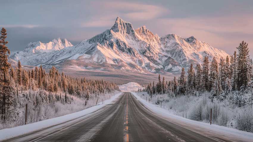
Nothing substitutes for real depth. When shooting landscapes I make a habit of including a strong foreground element (rocks, foliage, a fence post) to give scale and a path inward. For portraits, a foreground blur (close leaves or architecture) can add a cinematic layer.
Applying Composition by Genre
The rules don't change, but the emphasis does. Each genre demands a different hierarchy of concerns, and understanding that hierarchy saves time on location.
Portraits
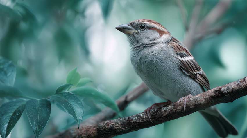
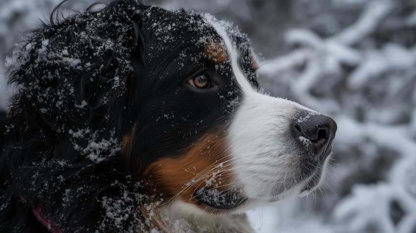
When I'm shooting portraits, my job is to make the viewer connect with the person in the frame. That means the subject's face, specifically the dominant eye, is the first thing a viewer should find. I place that eye near an upper-third intersection, which feels natural without being rigid. I've learned to trust telephoto lenses for portraits; an 85mm or 135mm equivalent compresses the face and flatters proportions in a way a wider lens can't. I shoot at apertures between f/1.8 and f/4, depending on the context. Tighter apertures if it's a close portrait, wider if I'm including environmental context.
One detail I'm careful about: breathing space. If my subject is looking or leaning to the left, I give space on the left side of the frame. It feels natural—like the subject has room to breathe, to exist, rather than feeling trapped against the edge. That small choice changes the entire mood of the portrait.
Landscapes
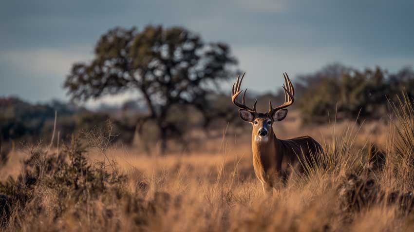
Landscapes are about depth and telling a story about a place. I almost always include a strong foreground element - a rock, a fence post, a fallen tree - something that anchors the viewer and creates a path inward. Without foreground, even a dramatic distant subject can feel flat and disconnected.
The horizon placement depends on what I want to emphasize. If the sky is dramatic, I push the horizon toward the bottom third. If the foreground is more interesting, I raise the horizon. Sometimes I use the golden ratio; it depends on the shapes and the light. I shoot wide - 16 to 35mm equivalent - and I'm religious about aperture: f/8 to f/16 to ensure depth of field that keeps both foreground and distance sharp. I'll bracket exposures when the light is harsh, because I almost always want to retain detail in both shadows and highlights.
Scouting angles on location is non-negotiable. I'll spend 20 minutes walking around a scene, looking for leading lines, layering opportunities, and the angle where foreground, subject, and distant elements align. It looks effortless in the final image, but it's the result of deliberate exploration.
Street & Documentary
Street photography is the opposite of landscapes: timing and instinct trump everything else. I carry a 35mm or 50mm prime because it's fast, lightweight, and forces me to move rather than zoom. I shoot at f/5.6 to f/8 to maintain flexibility - fast enough to keep depth of field if I miscalculate distance, wide enough to give me margin on focus.
The composition I use on the street is deliberate, but it happens fast. I look for frames: a doorway, an arch, a window. I position myself where I expect someone to cross through that frame, and then I wait. Sometimes it takes seconds; sometimes minutes. When the moment arrives, I have maybe two frames before it's gone. The best street work often uses frame-within-frame and juxtaposition - the intersection of two unrelated elements that suddenly become related in the frame. It's more about reading a scene and being ready than about careful setup.
Macro & Detail
When I'm working macro, every pixel matters. I want to fill the frame with texture, pattern, and detail. The goal is to make the viewer see something small as if they're seeing it for the first time—or as if it's monumental. I use macro lenses, and I'm careful about depth of field; usually I want just enough sharpness to define form, with the rest falling away. Diagonals work well in macro: a diagonal line across the small frame pulls the eye and creates energy in an otherwise constrained composition.
Practical Shooting Checklist and Settings I Use
On every shoot, I remind myself of one principle: compose first, then set exposure to match that composition. This flips the usual order - most photographers expose first, then crop. For me, the frame comes first. The exposure serves it.
My default settings shift by genre. For landscapes, I'm always on a tripod with ISO 100, shutter speeds that eliminate movement unless I'm intentionally capturing motion, and apertures stopped down to f/8 or f/16 for depth. Environmental portraits are different; I'll use a 50 or 85mm prime, apertures between f/2 and f/4 to separate subject from background, and ISO ranging from 100 in bright light to 400 indoors. For street work, I'm looser: 35mm, f/5.6 to f/8, and ISO as high as needed (200 to 1600 depending on light). I use continuous autofocus on the street because the subject is always moving; I use single-point AF for portraits because I need to lock focus on the eye.
One habit I never skip: I shoot a bracket. Even in good light, I'll expose at what I meter, then ±1 EV. In harsh or high-contrast light, I'll sometimes bracket ±2 EV. It takes seconds and has saved hundreds of otherwise-perfect images. I also use live view to check my composition before every shot—it's a moment to verify the background, scan the corners, check the horizon, and confirm everything is aligned before I press the shutter.
Editing to Improve Composition: What I Actually Do
I start with the RAW file and keep it intact. Everything I do is non-destructive until I'm ready to export. My first move is always straighten and level. A tilted horizon or vertical line that's not quite vertical will haunt the image; fixing it in the first pass saves time later.
Once the horizon and verticals are square, I crop. I'm looking for two things: is the subject well-placed? Does the composition feel resolved? If the subject is too close to an edge or the frame feels empty, I'll crop tighter or, occasionally, expand to include more context. I try different aspect ratios, 1:1 for symmetry, 4:5 for portraits, 16:9 for cinematic landscapes, and I see which feels right.
If there's clutter near the corners or distracting elements in the background, I'll use the clone and heal tools to remove them. But I don't overdo it. If the background is too busy, a tighter crop or stronger background blur during the initial shoot is better than trying to fix it afterwards. I'm careful about resolution; I don't want to crop so tight that the image degrades when it's printed or displayed at size.
Every photographer faces the same friction points in post-production: that high-ISO street shot with grain you can't fully clean without destroying texture, the macro image where shallow depth-of-field left edges soft, or a print-ready file that needs upscaling without the muddy artifacts traditional methods produce. Aiarty Image Enhancer solves these in one workflow. Its AI upscaling preserves detail where standard interpolation fails, the noise reduction algorithm works across shadows and highlights independently so you don't lose texture, sharpening adds bite without haloes, and batch processing means you can process dozens of images overnight. I use it on rescue shots, print prep, and any image where I want maximum technical fidelity.
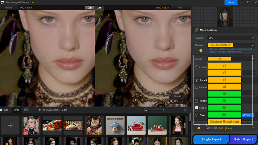
The difference isn't subtle. A 2x upscale for a 36x24 print, noise cleaned from a 3200 ISO frame, or soft macro edges restored—each saves an hour of manual layering and masking. Right now Aiarty is running 50% off everything during their anniversary sale with bonus credits included. Pair it with solid in-camera composition and you've got a complete pipeline. Claim the discount here.
Common Mistakes I See and How to Fix Them
The most common mistake I see is subject placement without intention. A subject creeping too close to the edge feels claustrophobic—the image becomes uncomfortable rather than composed. The fix is breathing space: recompose or crop to give the subject room. Even if I'm going for a tight crop, I want it to feel deliberate, not like an accident.
Busy backgrounds run a close second. A subject with sharp detail against an equally sharp, detailed background creates competition rather than focus. I fix this on location by changing my angle or increasing my aperture to blur the background. If I didn't catch it in-camera, I tighten the crop or use selective blur in editing.
Flat images - those without depth or layering - often result from shooting from eye level with no foreground interest. Adding foreground (real or in composition) is the fastest fix. Changing my angle, shooting lower or higher, or repositioning myself to align foreground, subject, and distance transforms a flat image into one with dimension.
Tilted horizons are easily corrected in post, but prevention is faster. I use a focus grid in live view to check the horizon before every landscape shot. Overusing rules is subtler but more insidious. I see photographers rigidly applying rule of thirds to every image, even when the shot demands something else. The rules are starting points, not mandates. Use them to strengthen the image; break them when the break serves the story.
Practice Drills I Recommend
Spend an hour with a single rule. Pick the rule of thirds and go shoot 50 frames where you actively place your subject on different intersections. Don't think about exposure or focus—just composition. Review which placements feel strongest and why. Do the same drill with leading lines; find scenes where lines naturally direct the eye and practice exaggerating that direction through angle and position.
Hunt for foreground. Spend a session looking exclusively for scenes where you can include strong foreground elements. Notice how foreground changes the spatial relationship between you, the subject, and the distance. A simple shift in position - ducking lower to bring foreground closer - creates depth that isn't there otherwise.
Find a repeating pattern and break it. Patterns are pleasing, but a single anomaly - one element of contrasting color, size, or shape - draws immediate attention. Practice isolating that anomaly and composing the frame around it. Street markets, architecture, nature scenes all offer repeating patterns.
Frame within a frame. Seek out windows, doorways, arches and overhang branches. Position yourself where a subject would naturally move through that frame, and practice timing. This teaches both composition and anticipation.
Finally, take one RAW file and produce three different crops that tell three different stories. Zoom tight for intimacy, pull back for context, or shift the subject off-center. You'll understand how cropping isn't rescue - it's a compositional choice that changes narrative.
 FAQs
FAQs
The intentional arrangement of elements inside the frame to direct attention and tell a story.
Use it as a fast starting point. Centering or symmetry can be stronger for certain scenes.
Yes. Cropping and cloning help, but get it right in-camera whenever possible.
No single lens. Use wide angles for context/depth and short telephotos for portraits/isolating details.
This post was written by Brenda Peng who is a seasoned editor at Digiarty Software who loves turning ordinary photos into extraordinary works of art. With AI assistance for brainstorming and drafting, the post is reviewed for accuracy by our expert Abby Poole for her expertise in this field.