


If you're following an older Lightroom tutorial and can't find Split Toning, look for Color Grading. To split tone a photo, use the Shadows and Highlights wheels to give the dark and bright parts of the frame their own tint. A dusk photo is an easy place to see it. Cool down the pavement and building shadows, then add a little amber to the lightest parts of the sky and storefront.
What makes split toning useful is the way it follows brightness. A white shirt in shade can pick up the shadow tint, while a bright reflection on a dark coat can take the highlight tint. Once you start looking at the light in the frame this way, it's much easier to predict where a grade will show up.
Where Is Split Toning in Lightroom?
Adobe replaced the Split Toning panel with Color Grading. You'll find the same two tonal ranges in each Lightroom app, although the panel sits in a different place.
On desktop, the three-wheel view lets you see the tonal ranges together. Select a single wheel when you want a closer view and more precise controls. On mobile, tap the Shadows or Highlights icon, then expand the controls beneath the wheel if you want to enter Hue and Saturation separately.
How to Split Tone a Photo in Lightroom
1. Get the exposure and white balance in place
Set white balance, exposure and contrast before choosing the tints. Use a neutral reference if you have one, and check whether the scene's existing warmth comes from the light itself. A late-afternoon portrait can look right with some warmth left in it. If lifting the shadows reveals colored speckles, handle that during your base edit so you can judge the tint against a cleaner image. Start with the Lightroom AI Denoise guide if you're working from a supported raw file.
2. Set the shadow tint
Open the Shadows wheel. Move around the wheel to choose the hue, then move outward from the center to increase saturation. On an evening street photo, try a blue-green hue with low saturation. Watch the darker pavement and building faces as you adjust it. If the effect is hard to see while you pick a hue, temporarily raise the saturation, then bring it back down once you've found the color you want.
3. Set the highlight tint
Open the Highlights wheel and start with a soft amber for the brighter surfaces. Watch pale walls, white fabric and skin in direct light. They make a strong tint easy to spot. Leave Midtones, Global and the Luminance sliders at their defaults for the first pass so you can judge the two tints on their own.
4. Adjust Blending and Balance separately
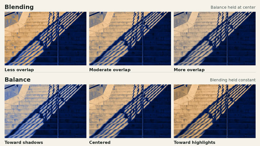
Blending changes how much the tonal ranges overlap. Start at 50, then try a lower and a higher setting with Balance held at zero. At lower settings, the two tints are more confined to their respective ends of the tonal range. Raise Blending and they reach farther into the middle. On a portrait, look at the transition from the shaded jawline to the lit cheek to see where the tint begins to carry across.
Balance shifts how much of the image is treated as shadow or highlight. Move it toward the negative side to give the shadow tint more room, or toward the positive side to extend the highlight tint. With Blending fixed, compare −30, 0 and +30 as a quick exercise. A small move from zero is often enough for the final edit.
3 Lightroom Split Toning Settings to Try
These values are starting points for Lightroom. Try them after your base edit, then tune saturation by eye. A file with cool ambient light may need only a trace of blue, while a more neutral file can carry more of it. The independently graded photo pairs illustrate the direction of each look.
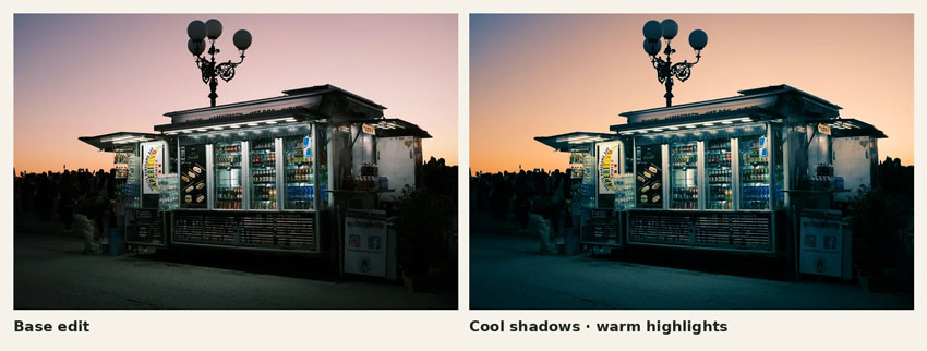
Warm highlights and cool shadows for a dusk street scene
The storefront, sky and shaded pavement already have different qualities of light. A blue-green shadow tint makes the shaded foreground feel cooler, while a small amber tint brings out warmth in the sky and other bright surfaces. Watch the white signage as you adjust the highlight saturation. If it turns noticeably yellow, pull the saturation back until the sign reads as white again.
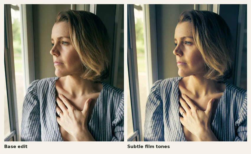
Subtle film tones for a window-light portrait
Window light can leave one side of a face warm and the other side in soft shade. Add a little gold to the brighter skin and a trace of blue to the darker parts of the frame. Keep an eye on the neck and the shaded side of the face, especially if the subject is near a green wall or foliage that already casts color into the shadows. Reduce the shadow saturation first if those areas turn too cool.
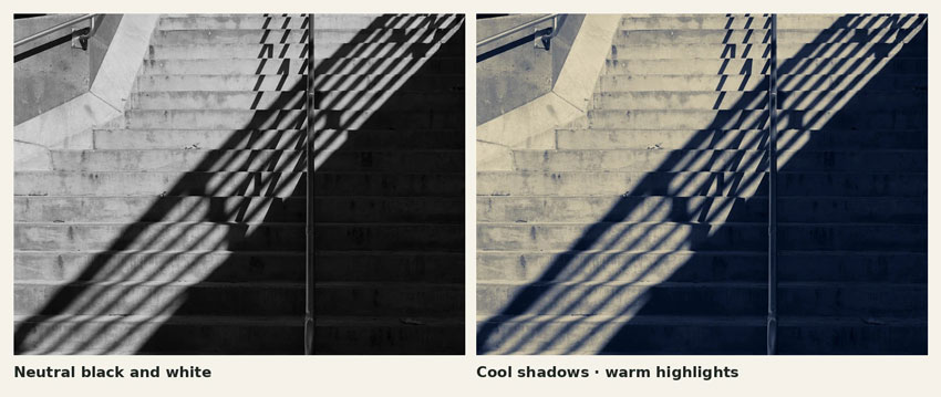
A two-tone finish for black and white
Convert the photo to black and white, then set the contrast and use the B&W Mix to separate tones if needed. On this staircase, a cool tint on the shaded steps and warm color on the lit concrete separate the two planes. The shadows along the handrail make a good place to judge the transition. Check the lightest concrete as well, where a small increase in saturation can turn a subtle paper tone into an obvious yellow cast.
Split Toning vs. Color Grading in Lightroom
If you're following an older tutorial, you can enter its hue and saturation values directly into the Shadows and Highlights wheels. The settings below show where the older controls went and which adjustments Color Grading added.
To recreate an older Split Toning recipe, start from the Color Grading defaults, set Blending to 100 and enter the original shadow and highlight Hue and Saturation values. Copy the original Balance value if the recipe specifies one. Leave Midtones, Global and Luminance at their defaults. Lightroom maps the split-tone settings in compatible older presets into Color Grading when you apply them.
How to Fix Common Split Toning Problems
- Skin has gone blue or green. Lower shadow saturation and look again at the cheek and jawline. If the color still spreads too far across the face, try less Blending. Check the photo with the grade off, too. If the cast is already present, fix it in the base edit before you bring the tints back.
- The midtones look muddy. Dial the two tints back one at a time. Two individually pleasing hues can make an awkward third color where they overlap. Try reducing Blending, or bring the two hues a little closer together on the wheel.
- The effect is hard to see. Temporarily raise saturation on one wheel to see where the tint lands. A bright, low-contrast scene may show very little shadow tint. Try a small move toward the shadow side of Balance and then return saturation to a level that suits the image.
When the source photo needs cleanup before grading
Split toning can make existing artifacts easier to notice. In a compressed night JPEG, for example, a cool shadow tint may draw attention to color speckles on pavement or blocky patches around signs. Aiarty Image Enhancer is a desktop tool for that cleanup stage. It processes supported files locally, with GPU acceleration on compatible hardware, and offers AI denoising, deblurring and upscaling. For a camera photo, the Real-Photo model is a good place to start. If the file already has enough resolution, keep the output at 1×, start with a modest Strength setting and check the preview at 100%. Look at both the smooth shadow areas and the details you want to retain, such as sign lettering, brick texture or hair.
If you're working in Lightroom Classic, Photo → Edit In → Aiarty Image Enhancer is available once the external editor is configured. Choose Edit a Copy with Lightroom Adjustments to carry over the base exposure and white balance. With a raw source, Lightroom Classic normally renders a copy such as a TIFF for this handoff. Finish the split tone on the enhanced file back in Lightroom, then use the Lightroom export settings guide for the destination you have in mind. The Aiarty and Lightroom workflow guide covers both the external-editor route and the plug-in workflow.

 FAQs
Can you save split toning as a Lightroom preset?
Yes. Create a preset and include the Color Grading adjustment. For a preset that only applies the grade, deselect exposure, white balance and the other edits before saving. That makes the preset easier to reuse on photos made under different light. The steps vary slightly by app, so see the Lightroom preset guide for your device.
Can you split tone a color photo?
Yes. Color Grading adds a tint to the existing colors according to how light or dark they are. Start with low saturation and watch familiar colors such as skin, white clothing and foliage. To change a particular source color, such as an oversaturated blue sky, use Color Mixer or Point Color. Those tools target the original color, while Color Grading follows brightness.
Can you apply the same split tone to multiple photos?
Yes. In Lightroom Classic, select the edited image and the other frames in the Filmstrip, keep the edited image active, and choose Sync in Develop. Select Color Grading in the sync settings. On a series made under consistent light, that gets the look across the set quickly. Review the brightest and darkest frames afterward, since the same settings may place the tint differently as exposure changes.

This post was written by Brenda Peng who is a seasoned editor at Digiarty Software who loves turning ordinary photos into extraordinary works of art. With AI assistance for brainstorming and drafting, the post is reviewed for accuracy by our expert Abby Poole for her expertise in this field.
