Summary: This post explains what color banding is, how it happens, and more importantly, how to fix it. Check them now. And do not forget to try Aiarty Image Enhancer to fix color banding in one click, if you need.
Part 1. What is Color Banding
Let's start with the basics: what exactly is color banding? If you've ever looked at a photo of a sunset or a digital painting and noticed harsh, unnatural stripes where you expected a smooth gradient, you've already met this visual villain. Color banding is a digital artifact that shows up when smooth color transitions - like the gentle shift from blue to orange in a sky - get broken into abrupt, visible bands of color. Instead of a seamless fade, you see steps, almost like a paint-by-numbers kit gone wrong.
Imagine you're editing a photo of a twilight sky. In a perfect world, the colors should blend smoothly from deep navy at the top to a soft amber near the horizon. But if you zoom in, you might see distinct lines where one shade stops and another begins. That's color banding in action.
How Does Color Banding Look?
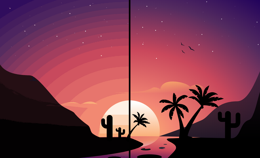
To really get a sense of it, think of two images side by side. The first shows a perfect gradient - let's say, a sky that melts from blue to pink with no visible lines. The second? That same sky, but with harsh, blocky stripes where the colors should blend. The difference is striking and, frankly, a little frustrating.
- Smooth Gradient: Colors flow effortlessly, with no visible edges.
- Color Banding: Noticeable stripes or bands, breaking up what should be a smooth transition.
You'll spot color banding most often in areas with subtle color changes - think skies, shadows, or softly lit backgrounds. It's especially noticeable in digital images and on screens that can't display a wide range of colors.
Where Does Color Banding Appear?
Color banding isn't just a digital photography problem. It can show up anywhere digital images are displayed:
- On your computer monitor or TV
- In compressed video streams
- Even on printed photos, if the file wasn't prepared correctly
It's a universal nuisance for photographers, graphic designers, and anyone who cares about image quality. And if you're like me - someone who loves turning ordinary photos into extraordinary works of art - color banding is the kind of detail that can make or break your masterpiece.
So now that you know what color banding is and how to spot it, let's dig into what causes it - and, more importantly, how you can fix it. Stick with me, and I'll walk you through the science, the solutions, and even a few creative twists on this digital dilemma.
Part 2. What Causes Color Banding
Now that we've identified color banding, let's roll up our sleeves and get to the root of the problem. Why do those unsightly stripes appear in your otherwise beautiful gradients? As someone who's spent countless hours editing photos and troubleshooting digital art, I can tell you: color banding is a classic case of "a little bit of everything can go wrong." Let's break it down.
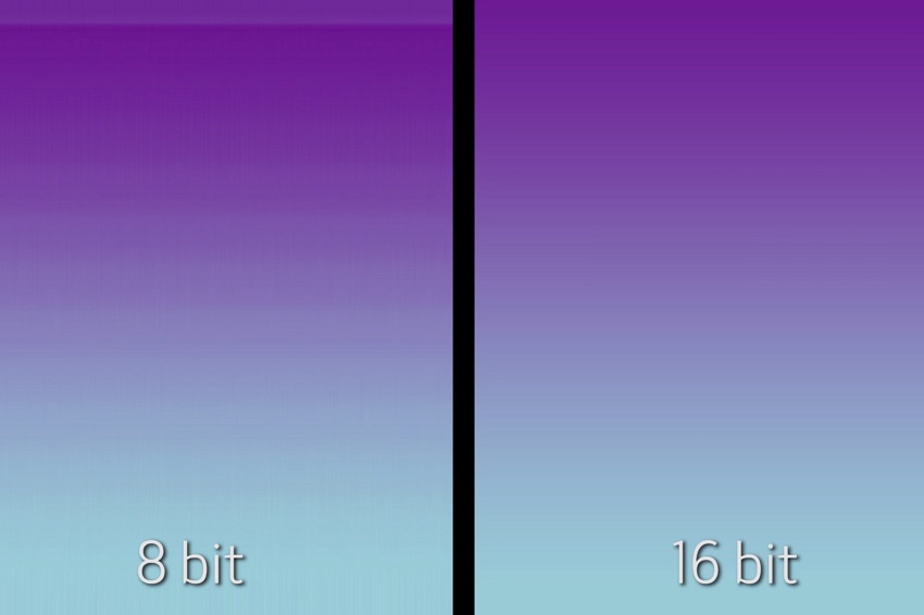
1. Limited Color Depth: The 8-Bit Problem
First and foremost, color banding is often a direct result of limited color depth - also known as bit depth. Most standard images and monitors operate in 8-bit color, which means each color channel (red, green, and blue) can display 256 shades. That adds up to about 16.7 million colors. Sounds like a lot, right? But when it comes to subtle gradients - like a sunrise or a foggy morning - those 256 steps just aren't enough. The result? You guessed it: visible bands instead of smooth transitions.
Professional monitors and high-end cameras often use 10-bit or even 16-bit color, offering billions or even trillions of possible shades. The difference is dramatic. If you're editing in 8-bit and then switch to 16-bit, you'll notice how much smoother your gradients become. This is why photographers and graphic designers (myself included!) swear by shooting and editing in higher bit depths whenever possible.
2. Compression Artifacts: Squeezing Out the Quality
Next up: compression. Ever wonder why your images look great straight out of the camera but start showing banding after you save them as JPEGs or upload them to social media? Blame compression artifacts. When you compress an image - especially with aggressive settings - some color information gets tossed out to save space. This is particularly true for JPEGs, which are notorious for introducing banding in areas with gentle color transitions.
It's not just photos, either. Video streaming services and even some games use texture compression to keep file sizes manageable. This can lead to banding in both the RGB (color) and alpha (transparency) channels. The more you compress, the more likely you are to see those ugly stripes.
3. Hardware Limitations: Your Display Matters
Let's not forget about hardware. Not all screens are created equal. Many budget monitors and older TVs are limited to 6-bit or 8-bit color, which means they simply can't display smooth gradients - even if your image file is perfect. If you're working on a display with limited color depth, banding will show up whether you like it or not.
4. Software Rendering Issues
Sometimes, the culprit is the software itself. Rendering engines, graphics drivers, or even your favorite photo editor can introduce banding if they don't handle gradients and color transitions properly. This is especially common in older or poorly optimized apps.
5. Editing-Induced Banding: When Good Editing Goes Bad
Ironically, the very tools we use to enhance our images can sometimes make things worse. Heavy-handed editing - especially when you push contrast, brightness, or color curves too far - can create "holes" in the histogram. These are gaps in the range of tones, which translate to abrupt jumps in color in your image. The result? More banding.
If you've ever cranked up the contrast on a sunset photo and suddenly noticed stripes in the sky, you've experienced editing-induced banding firsthand. It's a classic pitfall for both beginners and seasoned editors.
Part 3. How Color Banding Affects Photography and Digital Art
Let's get real for a moment: nothing ruins a breathtaking photo or a carefully crafted digital painting quite like color banding. As someone who's spent years behind both the camera and the computer, I can tell you - banding isn't just a technical flaw. It's a creativity killer.
Color banding slices through the immersive quality of an image. Instead of being drawn into a seamless sunset or a moody shadow, your eye gets snagged on those ugly, unnatural stripes. The result? The photo feels less professional, less polished, and - let's be honest - a lot less magical.
For photographers, banding can turn a portfolio shot into a throwaway. For digital artists, it can make a smooth gradient background look cheap and amateurish. Even casual viewers notice when something's off, even if they can't put their finger on it. The human eye is incredibly sensitive to smooth color transitions, especially in areas like skies, skin tones, and shadows. When those transitions are broken, the illusion is shattered.
Besides, color banding isn't just a digital problem, it also can haunt your prints, too. Why? Printers interpret color data differently than screens, and any banding present in your digital file can become even more obvious on paper. In fact, banding often becomes more visible in print because the human eye can pick up on subtle tonal breaks that might be hidden on a backlit display.
To minimize print banding, it's crucial to prepare your images carefully:
- Always edit and export in the highest bit depth possible.
- Use soft proofing tools to preview how gradients will look in print.
- Add a touch of noise or grain to break up visible bands (more on that in our solutions section).
Part 4. How to Detect and Analyze Color Banding
So, you've got a hunch that color banding might be sabotaging your images - but how can you be sure? Detecting banding isn't always as simple as zooming in and squinting at your screen. Sometimes, those sneaky stripes hide in plain sight, only to jump out at you on a different monitor or in a print.
As someone who's spent countless hours chasing down artifacts in both photos and digital art, I've picked up a few tricks to help you spot and analyze color banding before it ruins your masterpiece.
1. Tools and Software for Spotting Banding
First up, let's talk about tools. Professional photographers and editors often rely on specialized software to catch color banding early. Programs like Adobe Photoshop, Lightroom, and Affinity Photo allow you to zoom in, adjust levels, and inspect gradients with a critical eye. If you want to get technical, you can even use histogram analysis to look for "holes" or spikes that signal abrupt color transitions.
There are also dedicated diagnostic tools, like DisplayCAL or CalMAN, which help you evaluate how your monitor handles gradients. These can be a lifesaver if you suspect your display is making banding look worse than it actually is.
2. Visual Inspection Tips
But what if you don't have fancy software at hand? Don't worry - your own eyes are still your best tool. Here's how I do a quick banding check:
- Zoom in on any area with a smooth gradient, like a blue sky or a shadowed wall.
- Tilt your screen or change your viewing angle. Sometimes, banding becomes more obvious when you shift perspective.
- Adjust your room lighting. Banding can be easier to spot in dim or neutral lighting conditions.
If you're editing for print, always soft proof your image using your printer's color profile. What looks smooth on a backlit screen can turn into a striped mess on paper.
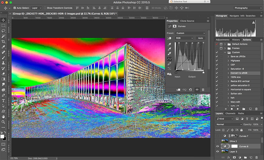
3. Solar Curves: The Secret Diagnostic Weapon
Here's a pro tip: use solar curves to reveal subtle banding. By dramatically increasing the contrast in your image using a "solarize" curve or an extreme S-curve in Photoshop, you can exaggerate tonal breaks that might otherwise go unnoticed. This trick is especially helpful for detecting banding in RAW files before you commit to edits or compression.
How to do it: In Photoshop, add a Curves adjustment layer and create a steep, jagged curve. Watch as hidden bands and tonal breaks leap out at you. Once you've diagnosed the problem, just delete the adjustment layer.
4. Differentiating Banding from Noise and Other Artifacts
It's important to remember that not all visual artifacts are created equal. Sometimes, what looks like banding is actually digital noise or compression artifacts. Here's a quick cheat sheet:
| Artifact | Appearance | Common Causes |
|---|---|---|
| Color Banding | Smooth, hard-edged stripes | Low bit depth, compression, editing |
| Digital Noise | Random, grainy speckles | High ISO, sensor limitations |
| Compression | Blocky, pixelated patches | JPEG, video streaming |
Knowing what you're looking at helps you choose the right fix - no more guessing games!
Part 5. How to Fix Color Banding
1. Software-Based Fixes for Color Banding
If you're staring down those stubborn color bands in your images, don't worry - software-based solutions are your best friend. With a few smart tweaks and the right workflow, you can transform harsh, blocky gradients into silky-smooth transitions. Here's how I tackle banding in my editing suite, and how you can do the same.
Method 1. Increase Bit Depth During Editing
One of the simplest yet most powerful ways to fight color banding is to work in a higher bit depth. Most images default to 8 bits per channel, which only gives you 256 shades per color. Bump that up to 16 bits, and suddenly you've got 65,536 shades - a massive leap in gradient smoothness.
In Photoshop: Go to Image > Mode > 16 Bits/Channel before you start editing. This ensures every adjustment you make preserves as much color detail as possible.
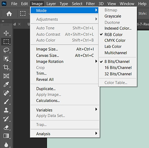
Why it matters: Editing in higher bit depth reduces the risk of introducing new bands as you tweak exposure, contrast, or color. It's especially important when working with RAW files or images destined for print.
Method 2. Use Dithering Techniques
Dithering is a classic trick that adds a tiny bit of randomness - think of it as controlled noise - to your gradients. This breaks up the harsh lines and helps colors blend more naturally.
How to dither in Photoshop:
- Create your gradient as usual.
- Add a new layer above your gradient.
- Fill it with 50% gray.
- Set the blending mode to Overlay.
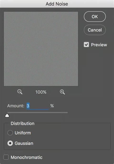
- Go to Filter > Noise > Add Noise. Use a low amount (1–2%) and check "Monochromatic" for best results.
How to dither in Lightroom: Use the Grain slider in the Effects panel to add a subtle texture that helps mask bands.
Method 3. Add Noise or Grain as a Workaround
If dithering sounds too technical, simply adding a touch of noise can work wonders. The trick is to use just enough to break up the bands without making your image look gritty.
In Photoshop: Duplicate your gradient layer, then apply Filter > Noise > Add Noise. Adjust the opacity to blend the effect gently.
In Lightroom: Increase the Grain amount under the Effects panel. Start small and build up until the bands fade away.
Method 4. Use Aiarty Image Enhancer for AI-Powered Debanding
Aiarty Image Enhancer is a powerful AI-driven tool designed to significantly improve image quality with just one click. Among its standout features is the ability to remove color banding and other JPEG compression artifacts through its specialized AI models. This AI tool effectively smooths out blocky pixels and color banding, restoring older or compressed images to a polished, natural look without harsh compression marks.
Beyond debanding, Aiarty Image Enhancer excels at denoising, deblurring, and upscaling images up to 32K resolution while preserving fine details and realistic textures. Its intelligent AI models adapt to different image types, making it ideal for fixing blurry photos, AI-generated images, and low-quality JPEGs.
For anyone seeking a smart, automated solution to fix color banding and enhance overall image clarity, Aiarty Image Enhancer offers a comprehensive and user-friendly option that delivers professional-grade results effortlessly. So why not download it now and follow the steps below to make you images smooth?
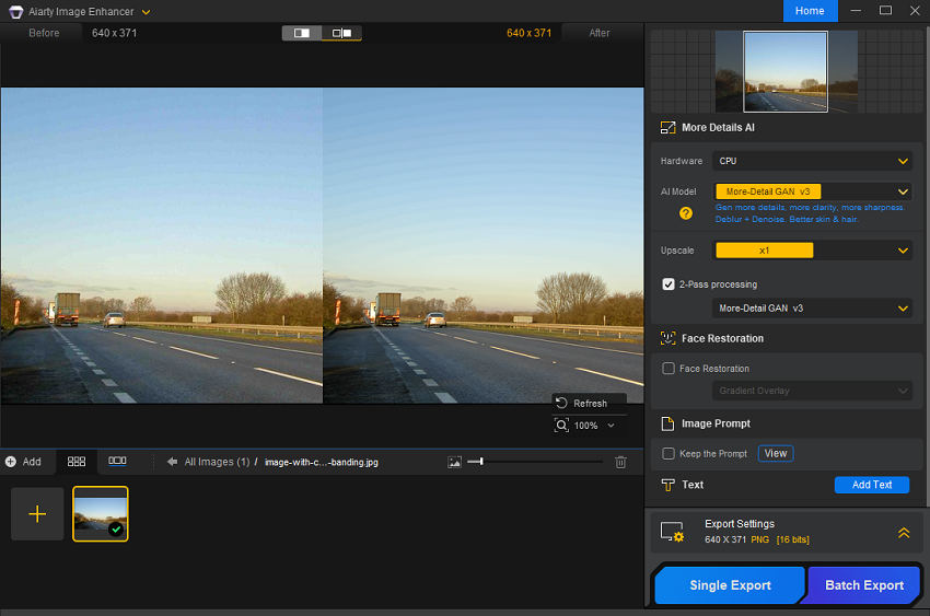
Step 1. Install and run Aiarty Image Enhancer on your computer. Then drag your image files into the program.
Step 2. Now head to the left side of the program, select one of the 5 AI models. Even though Detail GAN v3 is highly recommended, which works amazingly well with images that have intricate details, you can also try other models and get the best result.
Step 3. The pick the output resolution option. For debanding images, you can simply keep it at the original resolution. If you want to upscale your image to higher resolutions like 4K, 8K, or even much higher, select the specific resolution or the upscaling ratio you need.
Step 4. Finally, click the Export Settings option to set the format and bit-depth for your images. PNG and 16-bit combination is recommended. When you're ready, click Single Export to export the image with color banding removed. If you're processing multiple images at once, click Batch Export to export them all simultaneously.
2. Hardware and Display Adjustments for Tackling Color Banding
If you've ever edited a photo to perfection, only to see ugly stripes appear on someone else's screen, you know that hardware matters - a lot. The fight against color banding isn't just about clever software tricks. Sometimes, the real culprit is your monitor, your camera, or even your workflow. Here's how you can adjust your gear and setup to minimize banding and see your images as they're meant to be seen.
Method 1. Calibrate Your Monitor for Accurate Gradients
A well-calibrated monitor is the foundation of any editing workflow. If your display isn't showing colors and gradients accurately, you might miss subtle banding - or worse, over-correct and introduce new problems.
- Use calibration tools: Devices like the X-Rite i1Display or software like DisplayCAL help you set your monitor's color profile, brightness, and gamma.
- Check gradients regularly: After calibration, view test gradients to spot any lingering banding. If you see issues, your display's bit depth might be the limiting factor.
Method 2. Choose Monitors with Higher Color Depth
Not all screens are created equal. Budget monitors often use 6-bit or 8-bit panels, which can only display a limited range of colors and are prone to banding, especially in subtle gradients.
- Opt for 10-bit displays: Professional monitors with 10-bit (or higher) color depth can render over a billion colors, making gradients appear much smoother.
- Look for wide-gamut support: Monitors covering a high percentage of Adobe RGB or DCI-P3 color spaces provide richer, more accurate color transitions.
| Monitor Type | Bit Depth | Colors Displayed | Banding Risk |
|---|---|---|---|
| Budget/Office | 6-bit | ~262,000 | High |
| Standard Consumer | 8-bit | ~16.7 million | Medium |
| Pro/Editing | 10-bit+ | >1 billion | Low |
Method 3. Adjust Camera Settings for Higher Bit Depth
The best way to prevent banding is to capture as much color information as possible at the source.
- Shoot in RAW: RAW files store more color data than JPEGs, giving you greater flexibility in post-processing.
- Select highest quality settings: Many cameras let you choose between different RAW bit depths (12-bit, 14-bit, etc.). Always pick the highest available for critical work.
Method 4. Compare Results Across Multiple Devices
What looks flawless on your editing monitor might reveal banding on a client's laptop or a mobile device. Always preview your images on different screens to catch issues early.
- Test on various devices: View your work on smartphones, tablets, and standard monitors.
- Soft proof for print: Use soft proofing tools to simulate how your image will look when printed, as printers interpret gradients differently than screens.
Part 6. How to Avoid Color Banding in Photography
If you're passionate about capturing the world in all its colorful glory, nothing's more frustrating than seeing those dreaded bands ruin an otherwise perfect shot. Luckily, a few best practices can help you dodge color banding before it ever creeps into your workflow. Here's how I keep my images vibrant and smooth, straight from the camera to the final edit.
Tip 1. Shoot in RAW for Maximum Color Information
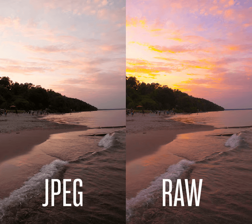
Always, always shoot in RAW format. Unlike JPEGs, which compress and discard a lot of color data, RAW files preserve every subtle tone your camera's sensor can capture. This extra color information gives you much more flexibility in post-processing - and dramatically reduces the risk of banding, especially in gradients like skies or shadows.
Tip 2. Avoid Excessive Post-Processing
It's tempting to crank up the contrast, push the saturation, or go wild with the curves, but heavy-handed edits can create "holes" in your image's histogram. These gaps translate to abrupt color jumps - aka banding. Try to make gentle, incremental adjustments instead of big, dramatic changes. This keeps your gradients smooth and your colors true to life.
Tip 3. Use Proper Exposure and Lighting
Getting your exposure right in-camera is key. Underexposed or overexposed shots lose valuable color information, making them more susceptible to banding when you try to recover details in editing. Aim for a well-exposed shot with balanced highlights and shadows. Good lighting helps, too: soft, even light produces smoother gradients and richer color transitions.
Summary
Color banding might seem like a small technical detail, but as we've explored, it can have a huge impact on the quality and professionalism of your photography, digital art, and even video projects.
At its core, color banding is caused by limited color depth, aggressive compression, hardware limitations, and sometimes even overzealous editing. Whether you're a hobbyist snapping sunsets or a graphics programmer rendering 3D worlds, understanding the causes of banding is the first step to avoiding those unwanted stripes.
No matter your skill level or creative field, being aware of color banding - and knowing how to tackle it - will help you produce images and videos that look polished, professional, and true to your vision.
You May Also Like
This post was written by Brenda Peng who is a seasoned editor at Digiarty Software who loves turning ordinary photos into extraordinary works of art. With AI assistance for brainstorming and drafting, the post is reviewed for accuracy by our expert Abby Poole for her expertise in this field.