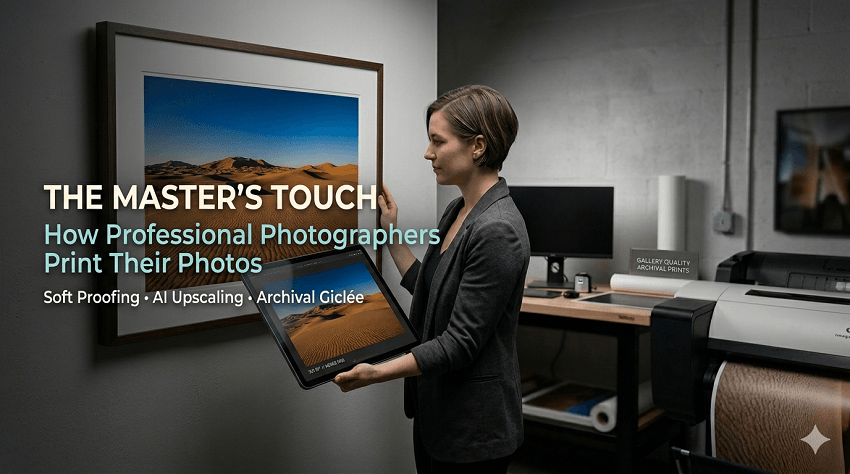
In an era where we can store thousands of high-resolution images in our pockets, the act of actually printing a photograph might seem like a nostalgic hobby. However, in 2026, we are witnessing a massive "tactile renaissance." Professional photographers and enthusiasts alike are rediscovering that a photo isn't truly finished until it exists in the physical world.
While digital screens offer convenience, they lack the permanence and emotional weight of a physical object. There is a documented surge in demand for physical photo products—from classic framed prints to high-end coffee table books. For many, the digital fatigue of scrolling through endless feeds has made the "tangible" photograph feel more premium and intentional than ever before.
If you've ever sent a photo to a local drugstore lab only to have it come back looking muddy, dark, or pixelated, you've experienced the gap between a "snapshot" and a "professional print." The pros don't just hit "print" and hope for the best.
A professional-grade print is the result of a controlled workflow. It involves:
- Precise color calibration.
- The selection of archival-grade materials.
- Intentional software preparation to ensure the image looks as good on paper as it did in the photographer's vision.
The goal of this guide is to demystify that professional journey. We aren't just talking about putting ink on paper; we're talking about the art of translation—taking the light captured by your sensor and turning it into a gallery-worthy masterpiece that will last for generations.
Step 1: Preparing the Digital Canvas
Before a single drop of ink touches paper, the most critical work happens at your workstation. Professional printing starts with a file that is "technically sound," meaning it has the data necessary to survive the transition from a backlit screen to a reflective physical surface.
1. Culling and Editing for Impact
Not every great digital photo makes a great print. Professionals start by culling—selecting images with strong compositions and clean focus. When editing, pros often "over-process" slightly compared to web versions, as paper absorbs light and reduces contrast. Starting with a high-quality RAW file is non-negotiable; it provides the maximum dynamic range needed to pull detail out of the shadows and highlights during the printing process.
2. Resolution and the "DPI" Myth
One of the biggest hurdles in printing is understanding DPI (Dots Per Inch).
- The Gold Standard: For a print that will be viewed up close (like a wedding album), 300 DPI is the target.
- Large Format: For giant wall art or canvases viewed from a few feet away, you can often drop to 150 DPI without a noticeable loss in quality.
The problem arises when you crop. If you take a 24-megapixel image and crop it heavily to fix the composition, you might be left with only 4 or 5 megapixels. If you try to blow that up to a 24x36-inch canvas, the result will be a blurry, pixelated mess.
3. The Pro Secret: Aiarty Image Enhancer
In the past, a heavy crop meant you simply couldn't print large. However, the modern professional workflow now includes a crucial "enhancement" step. This is where Aiarty Image Enhancer becomes an essential part of the toolkit.
Instead of relying on standard "interpolation" (which just stretches pixels and creates blur), Aiarty uses AI to actually reconstruct missing details.
- Upscaling without Quality Loss: If your file doesn't meet the 300 DPI requirement for the size you want, you can run it through Aiarty to upscale the resolution while maintaining—or even improving—sharpness.
- De-noising and Texture: It effectively removes high-ISO noise and generates lifelike textures, ensuring that skin tones, fabric, and landscapes look crisp and natural, even on a massive scale.
By integrating this tool here, pros ensure their "digital canvas" is dense with enough data to produce a sharp, professional-grade result regardless of the original file size.
Step 2: Color Management & Soft Proofing
If you have ever printed a photo only to find the colors look "off"—perhaps the vibrant sunset turned a muddy orange or the skin tones look slightly green—you've run into a color management issue. For professionals, ensuring that what they see on their screen matches what comes out of the printer is the most technical part of the job.
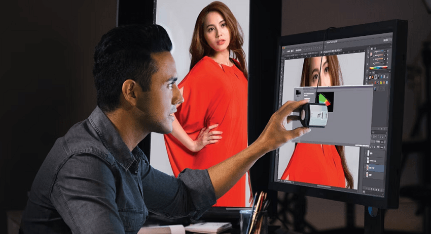
1. Monitor Calibration: Trusting Your Eyes
The first rule of professional printing is: You cannot trust an uncalibrated monitor. Most consumer screens (and even high-end laptops) are set to be overly bright and "cool" (blue-toned) to make movies and games look better.
Professionals use a hardware device called a colorimeter to calibrate their screens. This ensures that "middle gray" is actually gray and that the brightness level is dropped to a point that mimics the reflective nature of paper. Without this, your prints will almost always come out looking darker than they did on your glowing screen.
2. The Magic of ICC Profiles
Every combination of printer and paper has a specific "language" it speaks. A pro lab will provide ICC Profiles—small data files—for every paper type they offer (e.g., Fuji Lustre or Moab Entrada Rag).
By installing these profiles on their computer, photographers can tell their editing software exactly which printer and paper they intend to use. This creates a standardized "map" for the colors to follow.
3. Soft Proofing: A Digital Preview
Once the ICC profile is installed, photographers use a process called Soft Proofing. This allows the software to simulate the paper's characteristics directly on the monitor.
Gamut Warnings: The software will highlight "out of gamut" colors—shades that are too vibrant for the printer's inks to recreate.
Adjusting for the Paper: Since paper doesn't have a backlight, a soft proof often looks "washed out." This allows the photographer to make final, surgical adjustments to the contrast and saturation specifically for that print run.
4. Color Spaces: sRGB vs. Adobe RGB
While many photographers edit in Adobe RGB or ProPhoto RGB to capture the widest range of colors, many professional labs still require files to be submitted in sRGB. Pros carefully convert their files at the very last second to ensure the lab's machines don't "guess" the colors for them.
1. sRGB (Standard RGB)
The "Universal Language": This is the smallest common denominator. It was designed to match the capabilities of the average 1990s computer monitor.
- Best For: Web use, social media, and—surprisingly—most "consumer-pro" print labs.
- The Pros: Your colors will look consistent across almost every device.
- The Cons: It cuts out the most vibrant "extremes" of greens and cyans.
2. Adobe RGB (1998)
The "Photographer's Choice": This space was designed to include most of the colors achievable on professional CMYK printers. It is significantly larger than sRGB, especially in the greens and blues.
- Best For: High-end gallery printing and professional photography workflows.
- The Pros: It retains more "real-world" color data, making transitions and gradients smoother.
- The Cons: If you upload an Adobe RGB file to a website without converting it, the colors will look dull and washed out because the browser doesn't know how to interpret the extra data.
3. ProPhoto RGB
The "Archive" Space: This is the largest color space available. In fact, it is so large that it includes "imaginary colors" that the human eye cannot even see.
- Best For: The initial editing phase in software like Lightroom or Photoshop.
- The Pros: It ensures that no data from your RAW file is clipped or lost during heavy editing.
- The Cons: You must edit in 16-bit mode to avoid "banding" (choppy gradients), and you should never send this file directly to a printer unless it's a very specific fine-art boutique.
Step 3: Choosing the Right Medium (Paper & Beyond)
Once the file is technically perfect, the focus shifts from the screen to the senses. In professional photography, the "medium" is just as much a creative choice as the lighting or the composition. The material you print on dictates how light reflects off the image and how the viewer perceives the texture and depth.
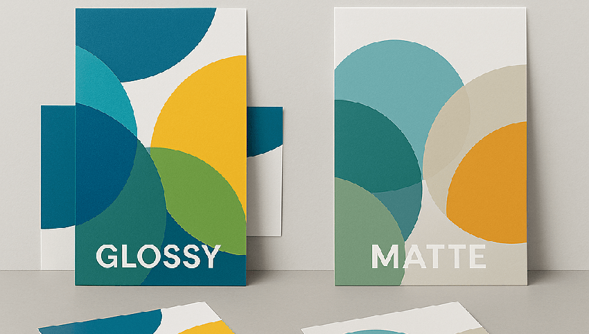
1. The Classic Trio: Lustre, Glossy, and Matte
Most professional labs offer these three foundational finishes, each serving a distinct aesthetic purpose:
- Lustre (The Industry Standard): A favorite among wedding and portrait photographers. It offers the vibrant colors of glossy paper but with a pebble-like texture that resists fingerprints and reduces glare.
- Glossy (High Impact): Best for high-contrast landscapes or sports photography. It offers the deepest blacks ("Dmax") and the most brilliant whites, making the image "pop," though it is highly reflective.
- Matte (The Fine Art Look): Deeply popular in 2026 for its organic, non-reflective surface. It's perfect for black-and-white portraits or moody, atmospheric shots where you want the viewer to focus on the "soul" of the image rather than the shine of the paper.
2. Premium Finishes: When Paper Isn't Enough
For statement pieces that act as the centerpiece of a room, photographers often look beyond traditional paper.
- Metal Prints (Infused Aluminum): Instead of printing on the surface, the image is heat-infused directly into a sheet of aluminum. The result is a staggering 3D depth and a glow that looks backlit. These are waterproof, scratch-resistant, and incredibly modern.
- Acrylic Blocks & Wall Art: The image is mounted behind a thick layer of polished acrylic. This "lens" effect magnifies the detail and color, making it look as though the photo is suspended in a block of glass.
- Canvas Wraps: While some consider it "traditional," a high-end canvas adds a painterly texture. It's a great choice for family portraits or soft-focus images where you want a classic, timeless feel.
3. Archival Quality: The 100-Year Rule
The biggest difference between a "pro" medium and a consumer one is longevity. Pros use acid-free, lignin-free papers and Giclée (pigment-based) printing. Unlike the dye-based inks in home printers that might fade in five years, archival pro prints are rated to stay color-accurate for 100 to 200 years when kept behind UV-protective glass.
Step 4: Finding the Right Lab
Even with a perfectly calibrated monitor and the right paper choice, the final result depends entirely on the machinery and chemistry of the lab. While it's tempting to head to a local convenience store for a quick 1-hour print, professional photographers almost exclusively use dedicated Pro Labs.
The difference lies in consistency, equipment maintenance, and the quality of the raw materials.
1. The "Big Box" vs. The Pro Lab
Consumer labs are designed for volume and speed. Their machines are often serviced less frequently, which can lead to "color drift"—where the same photo might look different if printed on two different days.
Pro Labs (such as Bay Photo, WhiteWall, or Nations Photo Lab) offer:
- Consistency: They maintain strict chemical and laser balances so your tenth print looks exactly like your first.
- Handling: Every print is inspected by a human eye before being shipped.
- Specialized Shipping: They use flat-pack reinforced cardboard or heavy-duty tubes to ensure your art doesn't arrive with "corner dings" or creases.
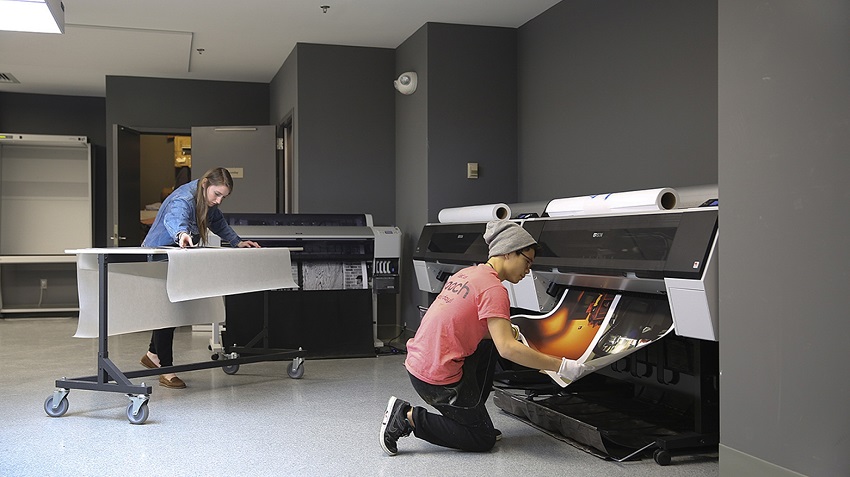
2. Giclée Printing (Fine Art Inkjet)
If you are looking for the absolute peak of quality, you'll likely hear the term Giclée (pronounced zhee-klay). This isn't just a fancy marketing word; it refers to a specific process using:
- Pigment-Based Inks: Unlike dye-based inks, pigment inks are made of tiny particles of color that sit on top of the paper, making them highly resistant to fading and UV light.
- High-Resolution Inkjet: These printers use up to 12 different ink colors (compared to the standard 4 in a home printer), allowing for incredibly smooth gradients and "true" blacks.
3. The Importance of Proof Prints
Before committing to a massive 40x60-inch metal print, pros will often order a test print or "proof." This is a smaller, inexpensive version of the final crop on the exact same material. It's the final "fail-safe" to ensure the brightness and sharpening are perfect before making a significant investment.
Step 5: The Final Presentation
The journey from a digital file to a physical object is nearly complete. However, a print—no matter how perfectly executed—is only half the story. The final stage is presentation, which transforms a piece of paper into a piece of art.
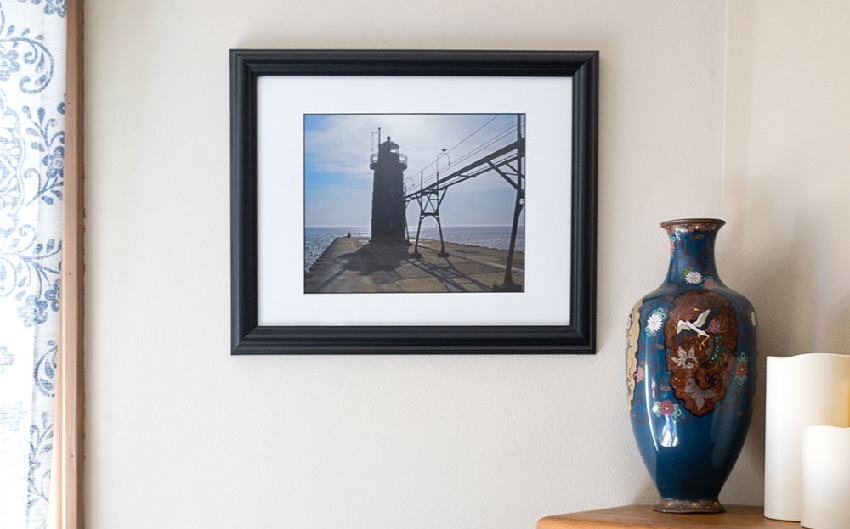
1. Framing: The "Window" to Your Art
A frame does more than just hold a photo against a wall; it provides a visual boundary that focuses the viewer's eye.
- The Role of the Mat: Professional photographers often use a mat (the cardboard border around the image). This creates "breathing room," preventing the image from feeling cramped by the frame.
- Conservation Glass: For high-end prints, pros use UV-protective or "Museum Glass." This specialized glass is virtually invisible and prevents the sun from bleaching the colors over time.
2. Mounting: Structure and Stability
For large prints, you can't simply stick them in a frame and hope they stay flat. Over time, humidity can cause paper to "wave" or ripple.
- Dry Mounting: Pros often have their photos mounted to a rigid backing like Gatorboard or Dibond (an aluminum composite). This ensures the print remains perfectly flat for decades.
- Float Mounts: For modern mediums like metal or acrylic, a "float mount" is attached to the back, making the artwork appear to hover an inch off the wall for a sleek, gallery-style look.
3. Lighting Your Art
Light is what created the photo, and it's what will bring the print to life.
- The 45-Degree Rule: To avoid glare (especially on glossy or metallic prints), aim your light source at a 45-degree angle to the surface.
- Color Temperature: Try to use bulbs with a high CRI (Color Rendering Index). Standard household bulbs can be very yellow, which will "warm up" your blues and greens. Look for "daylight" balanced bulbs to see the colors exactly as you edited them.
Conclusion
Printing is the final, definitive act of the photographic process. It's the moment a fleeting digital capture becomes a permanent heirloom. By following a professional workflow—from the initial technical preparation to the final framing—you ensure that your vision is preserved exactly as you intended.
As we've seen, the most common hurdle to a great print is a lack of data. Whether you are dealing with a heavy crop or an older digital file, don't let low resolution hold you back. Tools like Aiarty Image Enhancer have changed the game, allowing you to prep your files for the "big stage" by restoring detail and clarity that was previously lost.
The next time you capture an image that truly resonates with you, don't let it live out its life on a hard drive or a social media feed. Take it through the steps:
- Enhance and upscale your resolution.
- Calibrate your colors.
- Select a medium that speaks to the mood.
- Send it to a lab that cares as much about the details as you do.
There is nothing quite like the feeling of unboxing a professional print and seeing your work in physical form for the first time.
You May Also Like
This post was written by Brenda Peng who is a seasoned editor at Digiarty Software who loves turning ordinary photos into extraordinary works of art. With AI assistance for brainstorming and drafting, the post is reviewed for accuracy by our expert Abby Poole for her expertise in this field.